“Study Buddy Finder” Responsive Web Design
Project for Google UX Certificate Program
Date: July 24, 2021
Role: UX Designer
Tools Used: Adobe XD, Photoshop
Project Goal: As a part of Course 6: Responsive Web Design in the Google UX Certificate program, we were allowed to choose a prompt to inspire our design. I was lucky and received the following prompt as the first option to choose from; “create a study partner finder flow for an online university.” Our instructions for this project were to follow a typical design sprint, but the focus here would be on creating high-fidelity prototypes for both desktop and mobile views. Unlike the previous projects where the primary tool was Figma, our instructions indicated that we had to use Adobe XD.
Design Process: As with my previous projects in this certificate program, I started by trying to get a better picture of the challenge. My problem statement, “Students at Sullivan University need to find study buddies to help them pass their classes,” helped establish my direction and focus. While I had limited time to do research, I was able to do a quick competitive audit, surveying companies such as LinkedIn, Facebook, and Mooclab. There weren’t many study buddy finder applications that I could find, so this audit was slim.
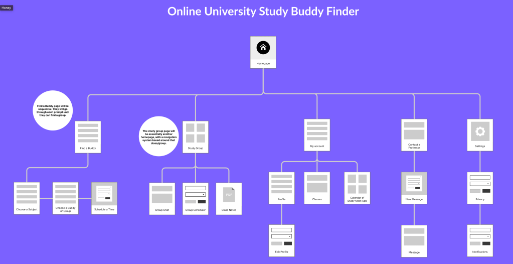
Next, I created a sitemap to outline the hierarchy of pages and get a better glimpse of the flow I had planned for my users. You can view that sitemap below.
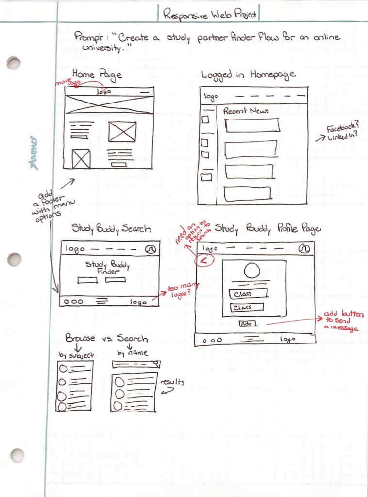
After I finished the research phase, I began to ideate some plans for the actual design. Again, time was limited, so I could only go through a couple of rounds of brainstorming before I had to create a low-fidelity prototype. You can view my preliminary wireframes below.
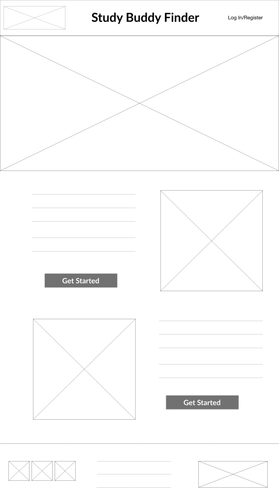
Now it was time to put Adobe XD to the test. My assignment required creating both a low-fidelity and high-fidelity prototype using the program. The low-fidelity prototype, which you can view by clicking on the following link: Low-Fidelity Prototype Preview, had to include multiple screens for review. I learned that my original flow did not include a loop or obvious prompts to encourage the user to continue, so I had to fix those before designing the high-fidelity version.
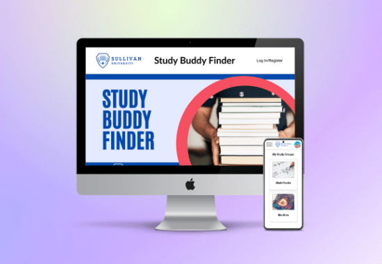
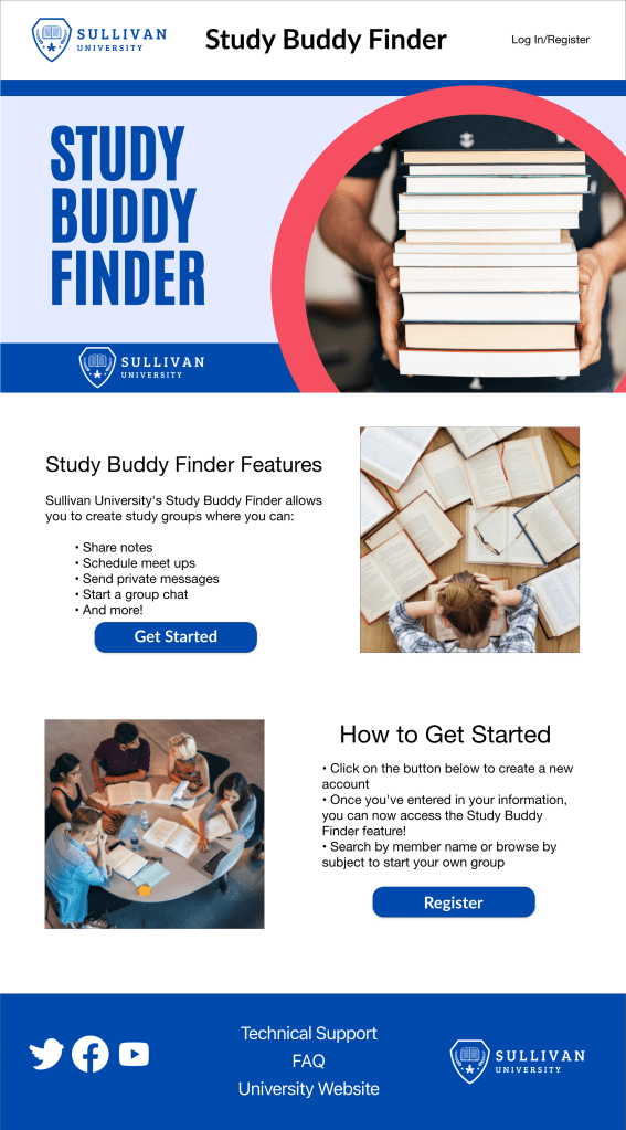
The high-fidelity version was more involved as I had to bring my visual design and interface content writing skills into the mix. I had a lot of fun creating the images for this project, including the hero image that you see on the homepage. If you would like to view the high-fidelity prototype, you can click on the following link: High-Fidelity Prototype Preview.
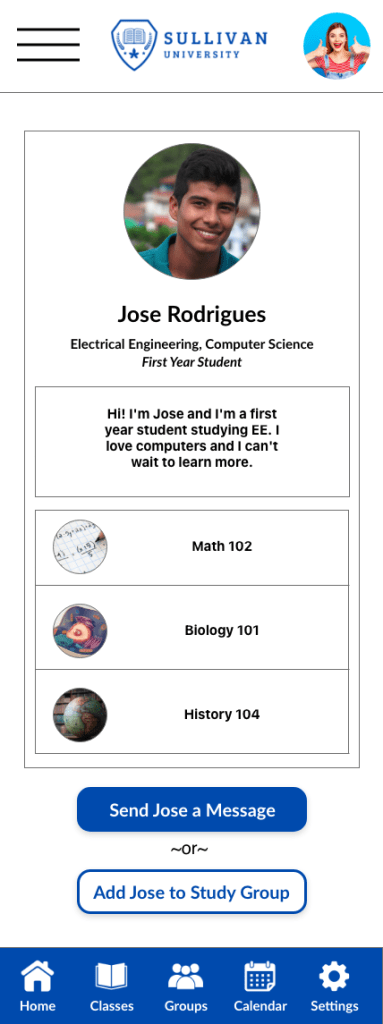
One of the biggest challenges for this project was figuring out how to have the same features across devices. I looked to LinkedIn for inspiration and used a sticky menu bar with icons along the bottom of the screen, which you can see to the right.
Outcome: I ended up with a 98% in the course overall, so I’m happy with the work that I produced. In the future, I would do a content audit and go through the flow from a strictly written text focus. I had focused a great deal on the user flow for finding a buddy, and I should have spent more time on the class views and text to encourage users to sign up. But overall, I’m excited about how the final product turned out.

You must be logged in to post a comment.